mdby……BUNKERTYPE #1
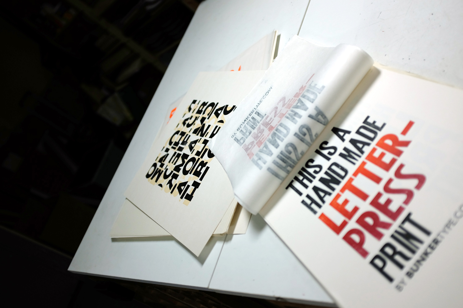
A fantastic visit to Jesús Morentín studio, a.k.a. , BUNKERTYPE, placed in a basement where time goes by surrounded by block letters and ink. I hope, be able to show you what an amazing time we had and how much we learnt from him!
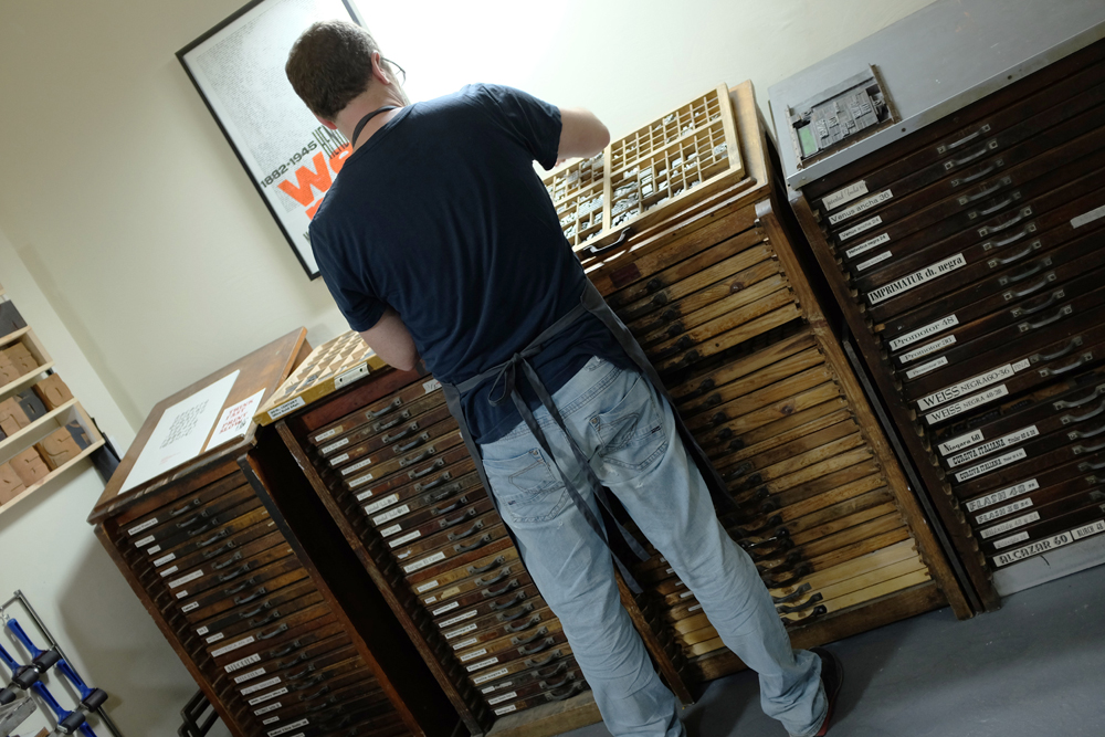
Jesús, since you first started to compile all the requested material for letterpress printing (printing by mobile terminal wooden and lead types), how has your life changed?
Undoubtedly my job at BunkerType has ended up displacing my professional projection, so now I must reconcile my work as a professor in all the schools I teach, with the huge amount of devoted hours needed to make this project work. This is translated into having less time for me and my family. However, the remarkable pleasure of being working in something I love and keeping on discovering new stuff day by day is a huge reward for me. Learning is something awesome that we usually stop doing when we reach a determined spot in our lives, almost without realising it. And suddenly, something catches your attention and you desire it to never stop. On the other hand, my work at Bunker has gave me the chance of knowing lots of interesting people with whom I share passion, emotions and work. A real luxury, indeed!
How has your learning process been, the reach of materials and info about each typography? It must have been such an extensive process…
The fact is that I’ve never thought about it as a process, mainly because during the first years I was just learning without any prefixed goal. I gradually discovered, by asking as much as I could and searching among the net. It was a really slow process, but also very satisfying one. Sometimes I spent weeks on finding out something which was quite easy, but I had no rush: I just enjoyed the process. Years came by and I realised that I wasn’t doing it so bad…
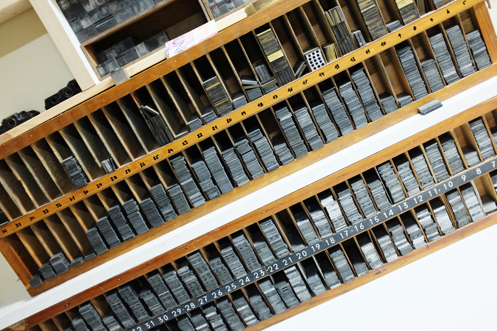
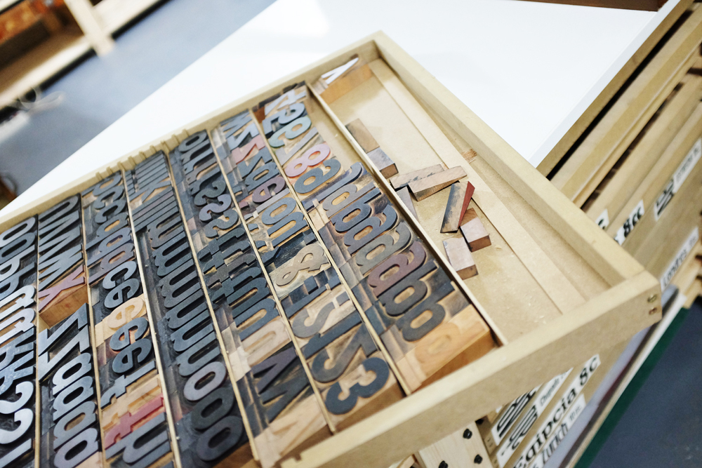
Other matter was about acquiring the material. At the beginning, I only had a few families of wooden block letters and nothing else. I thought it was enough added to an old restored letterpress I got, however, the amount of blocks requested to a proper start with is impressive and I must admit that really made me impatient to it. Besides, I had no idea about what was essential, so instead of going to old print shops without knowing what to ask for, I started buying the stuff online, basically from U.S.A. And United Kingdom. Little by little I learnt about the stuff and got through my initial shame. I began to identify old print shops where I could still find unused typographical stuff which I kept adding to my current personal collection (around 150 family lead letter block groups and 50 wooden ones), so as the huge amount of blank spaces needed by assembly, printmaking… In fact, this is a never-ending process: every time I can afford it, I keep buying interesting new stuff.
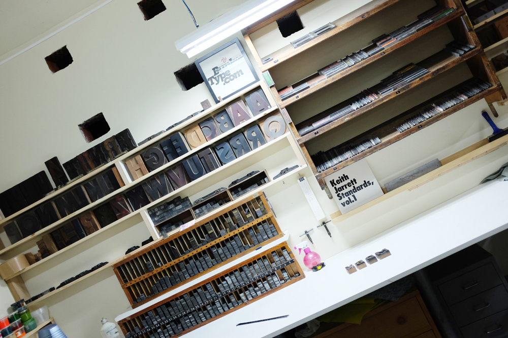
Each of your series I’ve seen, show a huge background and a remarkable poetic story, your designs are your own thinking, is there any of these personal thoughts that has result too difficult to be understood?
there any of these personal thoughts that has result too difficult to be understood?
Not everyone understands compositions and drawings – nor do I think it’s necessary – but my professional (de)formation as a designer forces me to always have something to tell, so that’s why I need that background you mentioned before: without having nothing to transmit I’m not able to move a finger. Thus, – and in a different way from an usual graphic design process – I don’t longer care about the receptor, or if the message is going to be clear or not. I just try to motivate my participations and to let the typographical elements to be the main characters. That is precisely why I always fulfil my pieces with some texts at my BunkerType website that contextualise and explain them, both as regards conceptual point of view and as technical and executive one.
Does Bunker from BunkerType come from your fist workspace?
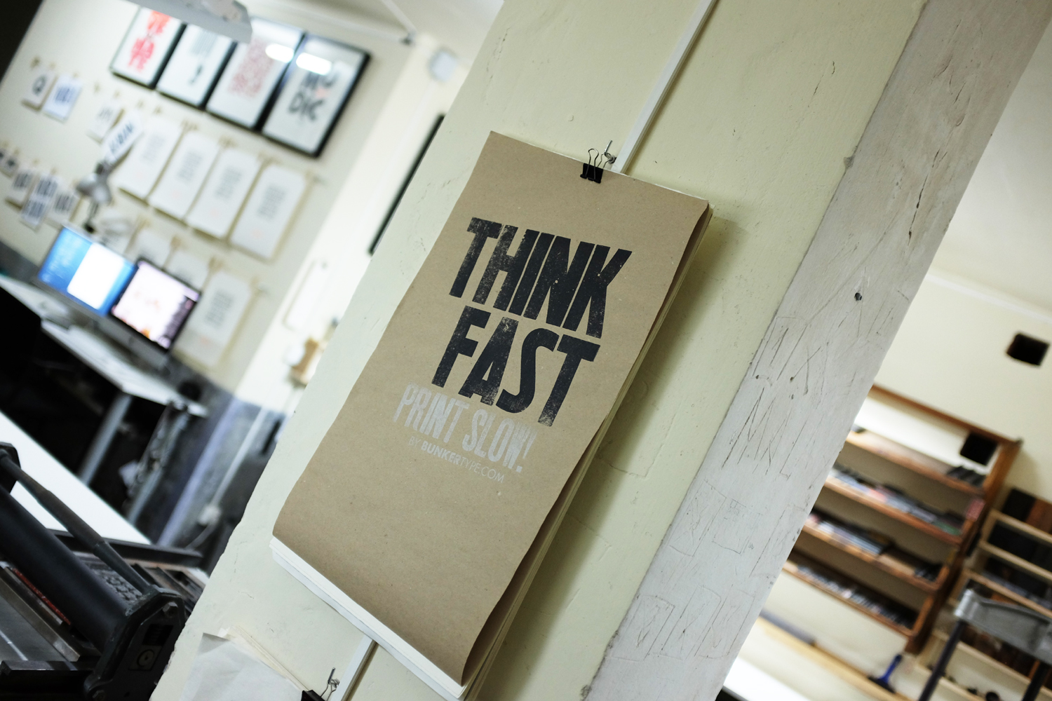
BunkerType was born in 2009, although at that time it didn’t have or need any name. At the beginning it was only a small storage-room, no bigger than 8m2. I gradually acquired typographical blocks and a small manual Boston, which I didn’t even know where to place. Thanks to my faithful neighbour who gave me the opportunity of demolishing his dividing wall, I joint two storage-rooms and doubled my business: nothing less than 18m2! As you might know, that was a real luxury for me, but being realistic, it still was a small hole deep underground. When I decided I was ready to show my work, I had to baptise my workshop and without hesitations I used “Bunker” as an old friend used to warmly call my invention.
Nowadays I have a 70m2 space at the same building, but the appearance still reminds to the first Bunker. Its spirit still remains too so the name kept unchangeable: let’s say that it is still a Bunker underground, but bigger and way more comfortable….
Which letter has a deeper meaning to you?
Some letters, especially in some wooden letter blocks, have characteristics that make them special, due to its atypical modulation, its spatial features or the absence of optical corrections present in any current alphabet, but beyond that I don’t have any special predilection to any in particular. Although, if it’s any consolation, I always looked for “a” box in order to know how a letter family looks like.
Why there is always something orange on your prints?
The truth is that there’s nothing premeditated although you might be right. In the past, texts were always printed in black, leaving red colour as a secondary ink for initials or notes, it’s probably part of my DNA; I work with really simple elements and concepts, in that sense I think that my colour palette could end up being rather skinny.
At the office we use Abel typo, any history behind it?
There’re thousands of typographies! No, I don’t have any extra information related to that font, although I recommend you to carefully observe to letter “g” on a big enough body: it’s worth looking!
You run workshops at your letterpress workspace, do people get hooked and continue with their training?
I don’t plan the workshops as a training element faced to printing profession. When I was young I worked in a print shop and I learnt about its difficulties. The operators at that print shop started learning about the business since their young beginnings, promoting from 5th grade trainees to 4th, 3rd,… until reaching the category of Officer, in which they must had to promote until 1st Officer. When someone intends me to explain about printing profession, I always talk about this story.
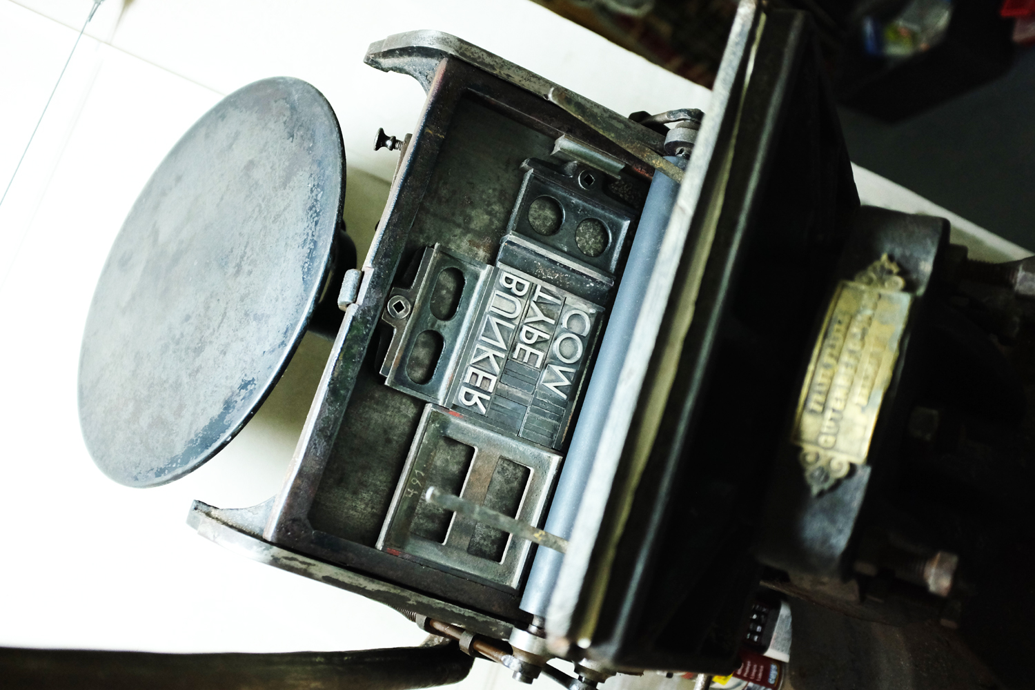
On the other hand, what I do try to transmit through the workshops is the amazing feeling of physically working with letter blocks, in a tangible manner. There are so many different concepts, origins or conventions, used on typography – and logically applied to digital typography too (the one used by our computers) – which are way more comprehensive and logic explained by the traditional system. You’ll only need to place an “S” from any wooden alphabet inside a typographical form: first of all, you’ll realise that it’s a reversible piece and you might ask yourself if placing it in one direction or in other really matters. After that, as you print it, you’ll probably observe that something is not properly working and you’ll try by turning the letter block up and down, showing the complex system of corrections and visual compensations used in graphically building each letter block (in this case, a light elevation over the central axe which divides the letter and compensates the visual weight of the superior body over the inferior one). Another even easiest experiment: pick a geometrical alphabet whose “O” letter has a circular shape (for example, Futura font) and compare two letter blocks that contain both “O” letters. If you keep turning these two blocks and confront them, you will find out that the block which contains them is not a perfect square. This characteristic – which might well be unnoticed in the digital system – is strongly shown in the mobile system and allow us to understand how optical corrections are needed to show circular elements (as a paradox, in order to show a circle as it is, we must do a slight width decrease). Finally, something as simple as the size: we all know that a typographical body is measured in points, but… what is a point? What does it mean that a letter is 36pt height? Which is the measurable distance on a letter? All these answers unknown by a majority of designers, might be explained just by holding one lead type… In brief, I’ll never end…
What the most attractive aspect for those who attend your workshops? And about you, to give them?
Actually, both workshops and online shop, arose for making BunkerType self-sufficient: the idea was adding new material from the workshops and the purchase of online sales, although I’m afraid that my impatience and eagerness were stronger. Anyway, workshops are other way of sharing my activity down in the Bunker and knowing interesting and very grateful people. Mainly designers, professionals or students, artists and people who are keen on the field, join the workshop in order to find out more about something that they barely know before, just by reading on books. The fact is that they build a nice and warm work atmosphere and when they are absorbed on the work it’s hardly impossible to throw them out! Something that I’ve learnt through all these years is that we tend to be so used on working on the results rather than on the process that when this order is inverted, we lose track of time. This is a very satisfying feeling.
What would you say to encourage people to sign up for a letterpress printing workshop using lead and wood mobile typos?
Sorry about saying this so sincerely, but if someone needs any external motivation to attend any of these workshops; I rather say they should stay at home…
It will continue… and we’ll show you the mini workshop we attended to!!